

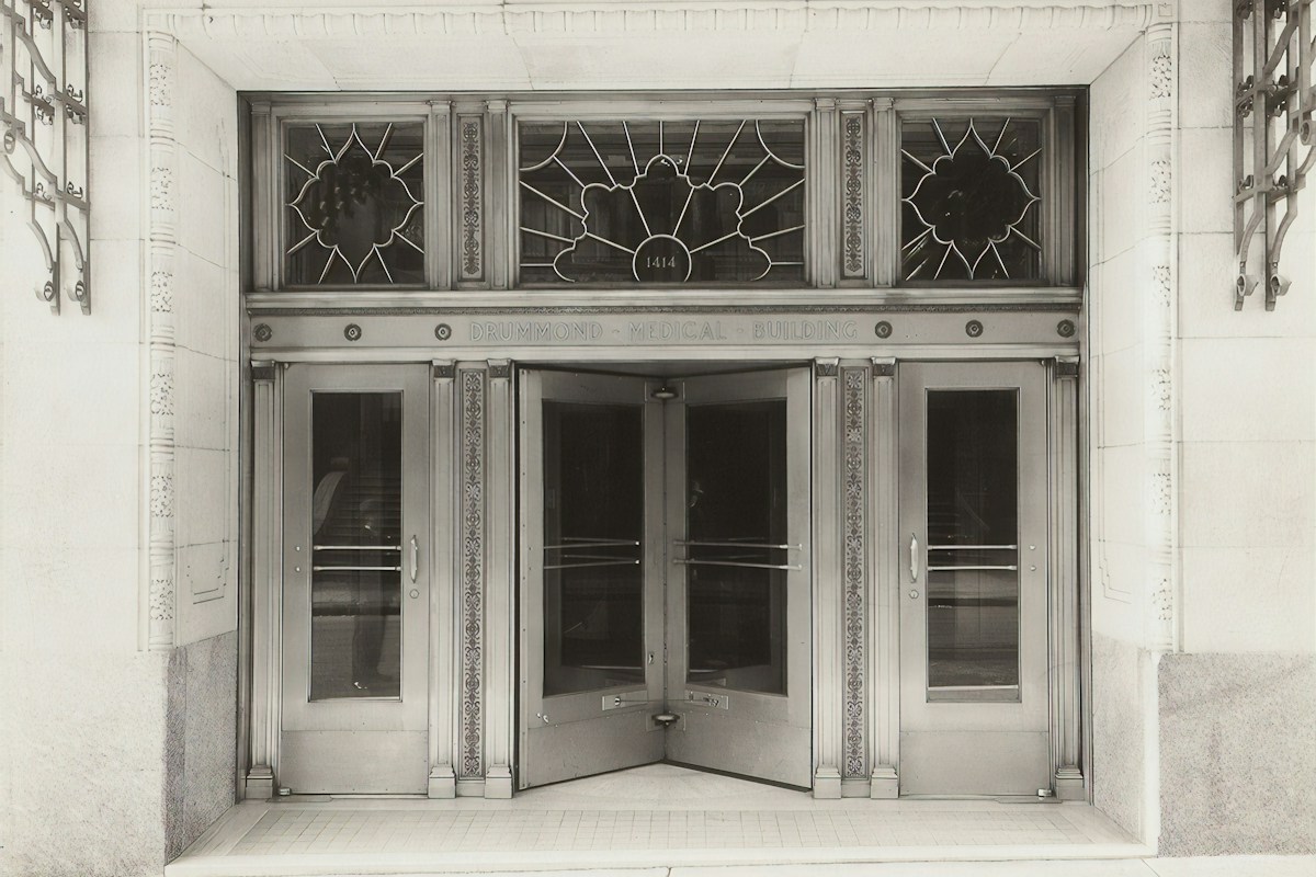
Look up at the stainless-steel sunburst spire of the Chrysler Building piercing the Manhattan sky, or examine the gilded bronze elevators of Rockefeller Center, and you are immediately struck by an aesthetic language of absolute speed, luxury, and triumphant modernity: Art Deco. Born in the euphoric aftermath of World War I and codified at the historic 1925 Exposition Internationale des Arts Decoratifs et Industriels Modernes in Paris, Art Deco was the definitive visual manifesto of the machine age. It rejected the sinuous, asymmetrical floral tendrils of Art Nouveau in favor of sharp aerodynamic zigzags, stepped ziggurat crowns, mathematical symmetry, and bold, unapologetic geometric dynamism.
Nowhere was this cultural revolution more intensely expressed than in the realm of typography, graphic design, and poster art. Between 1920 and 1939, European and American graphic artists transformed letterforms from utilitarian instruments of reading into monuments of architectural sculpture. Typefaces like Bifur, Peignot, Broadway, Futura, and Kabel stripped away traditional calligraphic serifs, reconstructing the Latin alphabet using pure Euclidean geometry: compass-drawn circular arcs, severe 45-degree diagonals, dramatic thick-thin stroke contrasts, and stylized drop-shadows that radiated the mechanical energy of the locomotive and the ocean liner.
In this authoritative historical and typometric guide, we examine the visual identity of the Roaring Twenties and Thirties. We explore the architectural and technological influences that forged Art Deco lettering, deconstruct the graphic masterworks of A.M. Cassandre and Edward McKnight Kauffer, analyze the foundry engineering behind iconic display typefaces, and provide contemporary designers with practical methods to incorporate authentic Art Deco geometry into modern brand identities.
1. The Paris 1925 Exposition: The Birth of a Global Aesthetic Movement
While geometric tendencies had been circulating through European avant-garde art circles since the early 1910s, the official global christening of Art Deco occurred at the 1925 Exposition Internationale des Arts Decoratifs et Industriels Modernes in Paris.
Spanning fifty-seven acres along the banks of the Seine, the 1925 exposition was conceived by the French government to re-establish Paris as the undisputed global capital of luxury, fashion, and industrial craft following the devastation of World War I. Crucially, the exposition rules established an uncompromising edict: all exhibited works had to be resolutely modern; direct copies or pastiches of historical styles (such as Louis XIV, Gothic, or Renaissance) were strictly banned.
Over sixteen million visitors walked through pavilions designed by masters like Jacques-Emile Ruhlmann, Rene Lalique, and Le Corbusier. What they witnessed was a sensational synthesis: ancient non-Western cultural motifs synthesized through the lens of industrial production. The visual motifs displayed across pavilion facades, exhibition catalogs, and advertising posters-streamlined cheetahs, stylized fountains, radiant sunbursts, and geometric stepped lettering-established a unified visual vocabulary that conquered design from London and Berlin to New York, Shanghai, and Buenos Aires.
2. Rejection of Art Nouveau: The Shift from Organic Sinew to Industrial Precision
To appreciate the structural geometry of Art Deco typography, one must understand the aesthetic rebellion that preceded it: the violent overthrow of Art Nouveau.
Dominating European design from 1890 to 1910, Art Nouveau-embodied by Hector Guimard’s Paris Metro entrances and Alphonse Mucha’s lithographic posters-worshiped the biological natural world. Its letterforms and ornamental flourishes were defined by the “whiplash curve”: sinuous, languid, asymmetrical lines mimicking undulating water lilies, creeping ivy, and flowing tresses of female hair. While decorative and ethereal, Art Nouveau was an inherently artisanal, handcrafted movement that resisted industrial mechanization.
Following the industrial mass-mobilization of the First World War, young artists found Art Nouveau’s melancholic romanticism decadent, outdated, and dishonest. The modern world was no longer a tranquil botanical garden; it was an exhilarating landscape of roaring rotary engines, soaring suspension bridges, electrical dynamos, and high-speed transcontinental trains. Art Deco replaced biological curves with the mathematical precision of the ruler, the compass, and the drafting square, declaring that beauty resided in industrial symmetry, clean angularity, and aerodynamic velocity.
3. The Archeological Spark: King Tutankhamun and the Ziggurat Silhouette
While Art Deco celebrated the machine age, its visual identity was equally energized by an astonishing archaeological discovery that captivated the global public imagination: British archaeologist Howard Carter’s November 1922 unearthing of the intact tomb of Pharaoh Tutankhamun in Egypt’s Valley of the Kings.
The global mania for “Egyptomania” coincided precisely with the emergence of Art Deco graphic design. European and American designers were hypnotized by the rigid geometric discipline of ancient Egyptian hieroglyphics, monumental papyrus capitals, and tomb frescoes. Unlike classical Greco-Roman ornament, Egyptian decorative art was highly stylized, two-dimensional, and structured around rhythmic repetition and solar symbolism.
Simultaneously, fascination with pre-Columbian Mayan and Aztec step-pyramids in Central America infused Art Deco architecture and typography with the iconic stepped ziggurat profile. Letterforms began incorporating stepped terminals, multi-layered chevron contours, and stylized winged sun-discs. In metropolitan skylines, municipal zoning laws (such as New York’s 1916 Setback Ordinance) mandated that skyscrapers taper inward as they rose to allow sunlight to reach the streets. Typographers mirrored this architectural silhouette, designing display capitals with stepped outer borders and tiered drop-shadows that echoed the monumental profiles of the Chrysler and Empire State Buildings.
4. Cubism, Futurism, and De Stijl: Avant-Garde Theory Meets Commercial Print
Art Deco was not merely a decorative trend; it was the commercial democratization of the most radical European avant-garde art movements of the early twentieth century: Cubism, Italian Futurism, Russian Constructivism, and Dutch De Stijl.
From Pablo Picasso and Georges Braque’s Cubism, Art Deco graphic designers absorbed the fragmentation of space and the reduction of complex physical objects into interlocking geometric planes: cones, spheres, cylinders, and polyhedrons. From Filippo Tommaso Marinetti’s Futurism, designers adopted an obsession with speed, dynamic diagonal vectors, and typographic dynamism, breaking the traditional horizontal baseline to send words soaring diagonally across poster layouts.
From De Stijl and the German Bauhaus, typographers learned the radical purity of the grid and the functional reduction of letterforms to elemental lines and circles. However, while Bauhaus purists viewed geometry through an austere, socialist lens of utilitarian restraint, Art Deco graphic artists infused those same geometric principles with commercial glamour, metallic opulence, and theatrical spectacle, making modernist visual theory wildly irresistible to the burgeoning middle-class consumer society.
5. A.M. Cassandre: The Titan of Geometric Advertising Posters
No individual artist personified the graphic genius of Art Deco with greater brilliance than Ukrainian-French commercial poster artist Adolphe Jean-Marie Mouron, universally known by his professional pseudonym, A.M. Cassandre.
Working in Paris during the 1920s and 30s, Cassandre transformed commercial poster design into a high-art discipline. He recognized that the modern street was an environment of rapid movement: pedestrians, streetcars, and automobiles sped past billboards in fractions of a second. A poster could no longer be a delicate, text-heavy illustration; it had to function as a powerful, instantaneous visual telegram.
In legendary lithographic posters such as Nord Express (1927), Etoile du Nord (1927), and L’Atlantique (1931), Cassandre constructed images with monumental architectural authority. In L’Atlantique, the massive black hull of a luxury ocean liner is rendered as an enormous, monolithic rectangle that fills the frame like an unshakeable wall of steel, juxtaposed against a tiny tugboat to emphasize titanic scale. Cassandre integrated typography directly into the visual architecture: the letters were not slapped over the image; they were precision-drafted components of the geometric grid, harmonizing with the perspective lines to draw the viewer’s eye magnetically into the composition.
Cassandre’s genius reached its kinetic peak in his celebrated 1932 sequential triptych campaign for the French aperitif Dubonnet: the immortal “Dubo, Dubon, Dubonnet” posters designed for the Paris Metro. Mounted sequentially along subway tunnel walls, the three posters engaged the moving train commuter in a narrative progression: in the first panel, an outline figure of a man looks at an empty glass under the syllables “DUBO” (meaning dubious); in the second, he drinks and color fills his body under “DUBON” (meaning good); in the third, he smiles broadly under the complete brand name “DUBONNET.” Cassandre demonstrated that when typography, color, and physical transit velocity are synchronized, advertising becomes kinetic cinema.
6. Bifur, Acier Noir, and Peignot: Cassandre’s Radical Foundry Typefaces
Beyond his poster art, A.M. Cassandre partnered with the prestigious French type foundry Deberny & Peignot to engineer some of the most radical, visually experimental display typefaces in typographic history: Bifur (1929), Acier Noir (1936), and Peignot (1937).
Bifur was a typographic shock to the system. Designed specifically for poster headlines, Bifur eliminated traditional solid letter strokes entirely. Instead, each character was constructed from a thick, minimalist black silhouette overlaid with fine, horizontal engraved hatch lines. The human eye was forced to participate actively in deciphering the letterform, blending the solid and hatched sections into a unified cognitive symbol. Bifur represented typography stripped down to its absolute abstract threshold.
In Peignot, created for the 1937 Paris World Exhibition under foundry director Charles Peignot, Cassandre attempted a profound philosophical reform of the Latin alphabet. Arguing that lower-case letterforms (minuscules) were medieval monastic corruptions of ancient Roman capital letters, Cassandre designed Peignot as a semi-uncial hybrid typeface: the uppercase characters were pure classical Roman capitals, while the “lowercase” characters were simply smaller capital letters, with ascenders and descenders added only to letters like ‘b’, ‘d’, and ‘h’. Cast in luxurious bronze and lead, Peignot became the enduring typometric voice of French sophistication.
Manufacturing these revolutionary typefaces required extraordinary metallurgical precision from Deberny & Peignot’s master punchcutters. Because designs like Acier Noir (1936) incorporated two-color bi-metallic effects-where characters were split into solid black halves juxtaposed against light gray or open outlines-the foundry had to cast dual lead matrices that locked into letterpress printing chases with zero mechanical tolerance for registration shift. Cassandre and Peignot proved that the physical limits of hot-metal lead casting could yield visual effects as sophisticated as modern multi-layer graphic software.
7. The Geometric Sans-Serif Revolution: Futura, Kabel, and the Grid
While Parisian foundries focused on luxurious, high-contrast display lettering, German type designers in the late 1920s launched an optical revolution that permanently reshaped global communication: the geometric sans-serif.
In 1927, German designer Paul Renner unveiled Futura, cast by the Bauer Type Foundry. Rejecting both the ornate Gothic blackletter traditional in Germany and nineteenth-century grotesque sans-serifs, Renner constructed Futura using pure, unadorned geometric shapes: the ‘O’ was a mathematically perfect circle, the ‘A’ and ‘V’ were sharp isosceles triangles, and the stems were clean, uniform rectangles. Renner eliminated all non-essential decorative appendages, declaring that modern typography must reflect the disciplined spirit of the machine age.
Concurrently, Rudolf Koch designed Kabel for the Gebr. Klingspor foundry, named in honor of the newly laid transatlantic telephone cable. While Futura pursued austere mathematical purity, Kabel infused geometric structure with subtle humanistic quirks: angled terminals cut at 45 degrees, a diamond-shaped dot over the ‘i’, and a low-slung, expansive ‘e’. Together with Eric Gill’s Gill Sans in Britain, these geometric typefaces provided Art Deco graphic artists with pristine, functional typographic anchors that balanced the decorative exuberance of their visual compositions.
Renner’s early working drawings for Futura were even more radical than the finished commercial release. His original 1925 prototype sketches featured experimental, non-traditional glyphs: an ‘r’ consisting of a vertical stem and a freestanding circular dot, a ‘g’ built from a circle connected to a triangular pedestal, and square dots on the ‘i’ and ‘j’. While the Bauer foundry’s technical director persuaded Renner to normalize these glyphs for commercial readability, the underlying mathematical architecture remained pure Euclidean geometry, establishing Futura as the definitive structural skeleton of twentieth-century modernist communication.
8. American Broadway: Morris Fuller Benton and the High-Contrast Display Craze
While European Art Deco pursued sleek architectural elegance, American graphic design in the late 1920s embraced the brash, dazzling theatrical energy of New York’s theater district, codified in the legendary typeface Broadway.
Designed in 1927 by Morris Fuller Benton, the prolific chief type designer for the American Type Founders (ATF), Broadway became the ubiquitous typographic symbol of the Jazz Age. Benton constructed the typeface on extreme, exaggerated stroke contrast: vertical stems were monumental, ink-heavy black slabs, while horizontal bars and circular joins narrowed to hairline ribbons.
Broadway looked like a neon marquee flashing under a Broadway theater canopy. It commanded attention with swaggering confidence, appearing across sheet music covers, cocktail bar signage, silent film title cards, and packaging for luxury cigarettes and gin. Benton followed Broadway with a companion design, Bifur-inspired variations and Parisian, cementing ATF’s dominance in commercial advertising and establishing a visual style that remains synonymous with 1920s speakeasy culture.
Benton’s ability to manufacture Broadway at commercial scale was made possible by his father, Linn Boyd Benton, who in 1885 had invented the pantographic punchcutting machine. This engineering marvel allowed ATF craftsmen to trace an artist’s large-scale original drawing on a brass plate and mechanically carve a steel punch at microscopic sizes with razor-sharp tolerances. For Broadway, the pantograph allowed ATF to preserve the knife-edge contrast between its massive, ink-drenched black downstrokes and its delicate hairline crossbars, ensuring that the letterforms maintained their theatrical punch whether printed at 12-point newspaper display or colossal 72-point billboard wood-type sizes.
9. Streamline Moderne: The Aerodynamic Teardrop and Low-Waisted Letterforms
As the exuberant prosperity of the Roaring Twenties gave way to the economic devastation of the Great Depression in 1929, the Art Deco aesthetic underwent a profound stylistic mutation: the emergence of Streamline Moderne.
Pioneered by industrial designers like Raymond Loewy, Walter Dorwin Teague, and Norman Bel Geddes, Streamline Moderne was obsessed with aerodynamics, fluid dynamics, and frictionless motion. Designers applied the teardrop profile to everything from locomotives and passenger aircraft to vacuum cleaners, refrigerators, and pencil sharpeners, rounding sharp corners and adding horizontal speed lines (“speed frets”).
Typography adapted instantaneously to this aerodynamic ethos. Letterforms lost their vertical, towering ziggurat rigidity and became horizontally expanded, low-slung, and swept-back. Streamline Moderne typefaces featured ultra-low waistlines-crossbars on letters like ‘E’, ‘F’, and ‘H’ were dropped to the bottom third of the frame-and letter proportions were stretched horizontally to convey low-friction ground-hugging velocity. Speed lines, horizontal hatching, and forward italics made words appear as though they were speeding down an open highway at ninety miles per hour.
10. The WPA Federal Art Project: Screen Printing and Democratic Modernism
In the United States during the depths of the Great Depression, Art Deco graphic design transformed from an exclusive luxury aesthetic into a powerful, democratic public instrument through President Franklin D. Roosevelt’s New Deal and the Works Progress Administration (WPA) Federal Art Project (1935-1943).
The WPA Poster Division employed hundreds of destitute commercial artists, printmakers, and typographers across the nation. Working primarily in workshops in New York, Chicago, and San Francisco, these artists created over two million posters promoting public health, literacy, theater productions, forest fire prevention, and travel to newly established National Parks.
Operating under tight municipal budgets, WPA artists perfected the art of silkscreen printing (serigraphy). Because silkscreen was an ink-stencil process, it demanded bold graphic simplification: broad fields of flat, opaque gouache color, minimal detail, and clean, geometric hand-lettering. WPA posters featured robust, geometric sans-serif capitals with strong drop-shadows and stepped perspectives, celebrating the dignity of labor, civil engineering, and public health with majestic, heroic modernism.
11. E. McKnight Kauffer and the London Underground Poster Revolution
While A.M. Cassandre reigned in Paris, American-born graphic designer Edward McKnight Kauffer was transforming the visual landscape of London through his historic, thirty-year collaboration with the London Underground (London Transport), under the enlightened patronage of publicity officer Frank Pick.
Frank Pick believed that the public transport network had a civic moral obligation to educate public visual taste. He commissioned Kauffer to design hundreds of promotional posters encouraging Londoners to use the tube to visit museums, weekend country retreats, and cultural landmarks. Kauffer, who had studied modern art in Paris, introduced British commuters to Cubism, Vorticism, and geometric Art Deco abstraction.
In iconic posters like Winter Sales (1919), Power: The Nerve Centre of London’s Underground (1931), and travel campaigns for the countryside, Kauffer combined stylized geometric figures with bold, architectural typography. Kauffer proved that commercial transport advertising could be sophisticated, avant-garde, and visually exhilarating, elevating the daily commute into an encounter with world-class modern art.
12. Shaded, Chiseled, and Multilayered Dimensionality: The 3D Letterform
One of the most striking physical characteristics of Art Deco lettering-seen across cinema marquees, storefront fascias, and packaging labels-was its obsession with three-dimensional relief and architectural chiseled modeling.
Art Deco typographers did not conceive of a letter as a flat, two-dimensional imprint on paper. They viewed letters as physical sculptures carved out of stone, forged in polished steel, or cast in illuminated glass. To achieve this sculptural weight on flat lithographic prints, designers developed intricate shading techniques: prismatic facets, central ridge lines, and deep isometric drop-shadows.
A typical Art Deco display capital featured a central chiseled spine dividing the stroke into two halves: one side rendered in brilliant highlight, and the opposing side rendered in deep shadow. This faceted geometry created the optical illusion that the letters were triangular prisms projecting outward from the surface of the paper. When paired with secondary drop-shadows offset at a severe 45-degree angle, these letterforms jumped off the page with theatrical three-dimensional power, mimicking the carved bas-relief limestone panels found on Art Deco civic monuments.
The technical instrument that enabled commercial illustrators to execute these mirror-smooth metallic gradients on poster art was the pneumatic aerograph (airbrush). By cutting hand-cut paper and frisket film stencils, artists sprayed finely atomized ink mist across chiseled facets, creating seamless transitions from glowing chrome highlights down to pitch-black drop-shadows. This airbrush technique gave Art Deco graphics their signature industrial sheen-a polished, airbrushed metallic radiance that looked as though it had been machined on an aerospace lathe.
13. Metallic Foils, Gilding, and Chromatic Opulence: Bronze, Chrome, and Gold
Art Deco was fundamentally an aesthetic of material luxury, technological optimism, and physical radiance. This material philosophy dictated a graphic color palette that broke sharply from Victorian somberness.
Graphic designers and printers made extensive use of metallic inks, hot-stamped gold foils, and polished chrome embossing. Luxury packaging for perfumes, champagne, cigarettes, and ocean liner maiden-voyage menus featured gleaming gilded borders and embossed bronze typography set against velvety backgrounds of obsidian black, midnight blue, emerald green, and rich burgundy.
This use of metallic finishes was a direct celebration of industrial metallurgy. Polished chrome and stainless steel (such as Nirosta alloy used on the Chrysler Building) were the wonder materials of the 1920s: impervious to corrosion, mirror-reflective, and modern. By incorporating metallic foils into print, designers gave graphic artifacts a tactile, reflective luminescence that caught ambient lighting, turning everyday paper products into precious luxury artifacts.
14. Magazine Covers and Editorial Geometry: Vanity Fair, Vogue, and Fortune
The cultural authority of Art Deco graphic design was broadcast into millions of affluent homes through the dazzling editorial design of prestige magazine publications, most notably Condé Nast’s Vogue and Vanity Fair, along with Henry Luce’s Fortune magazine.
Under the visionary art direction of European emigres like Mehemed Fehmy Agha (Dr. Agha) at Vogue and Vanity Fair, editorial layout design was completely modernized. Dr. Agha banished fussy Victorian borders and crowded column text, introducing vast white margins, full-bleed photography, and bold, geometric headline typography that integrated seamlessly with fashion illustrations by Eduardo Garcia Benito and Georges Lepape.
Simultaneously, Fortune magazine, launched in 1930 amidst the Great Depression, treated American industrial capitalism with monumental graphic majesty. Its covers, illustrated by master artists like Antonio Petruccelli and Herbert Bayer, depicted oil refineries, steel blast furnaces, locomotive crankshafts, and suspension cables through hyper-stylized geometric compositions paired with chiseled, architectural Art Deco typography. Fortune proved that heavy industry, when framed through the lens of Art Deco graphic geometry, possessed the heroic grandeur of classical mythology.
15. The Architectural Nexus: Typography Carved in Limestone, Bronze, and Terracotta
Perhaps the most permanent and magnificent manifestation of Art Deco typography exists not on fragile paper, but carved permanently into the physical fabric of modern cities: architectural typography.
During the skyscraper boom of the late 1920s and early 1930s, architects viewed typography not as an afterthought to be pasted onto a finished building, but as an integral structural and decorative element of the architectural facade. Above the grand entrances of municipal city halls, telephone company headquarters, power stations, and department stores, master stonecarvers and metalworkers executed monumental inscriptions in limestone, granite, architectural bronze, and glazed architectural terracotta.
These architectural inscriptions featured wide-tracking, low-waisted sans-serif capitals with faceted triangular cross-sections designed to catch the changing angle of the sun throughout the day. In buildings like London’s Senate House, New York’s 30 Rockefeller Plaza, and the Daily Express Building in Fleet Street, these carved letterforms stand as monumental declarations of civic pride, permanently petrifying the geometric optimism of the machine age in solid stone.
Spectacular regional variations emerged in American metropolitan centers: in Chicago, the 1929 Carbide & Carbon Building featured deeply chiseled gold-leaf lettering cast into dark green polished granite, designed to resemble a champagne bottle with gilded foil. In Los Angeles, Claud Beelman’s 1930 Eastern Columbia Building showcased towering turquoise glazed architectural terra cotta spires crowned with monumental blue neon numerals and chiseled bronze entrance lintels, transforming architectural letterforms into dazzling urban beacons visible across downtown night skylines.
16. The Decline and Demise: World War II and the Austerity of Modernism
The golden reign of Art Deco typography and graphic geometry came to an abrupt, tragic halt in September 1939 with the outbreak of World War II.
Almost overnight, the material opulence, decorative exuberance, and playful luxury that defined Art Deco felt completely inappropriate for a world engulfed in total war. Metal foundries diverted bronze, lead, and copper from decorative type casting into ammunition and munitions production. Luxury paper and metallic foils were strictly rationed, and advertising shifted from selling luxury consumer goods to military recruitment, war bonds, and industrial rationing campaigns.
In the post-war reconstruction era of the late 1940s and 1950s, the visual culture pivoted sharply away from Art Deco’s decorative drama toward the cool, objective, functional austerity of the International Typographic Style (Swiss Style). Led by Max Bill, Josef Muller-Brockmann, and the designers of Neue Haas Grotesk (Helvetica) and Univers, post-war design viewed Art Deco’s stylized geometric flourishes as decorative bourgeois excess. Typography was redefined as a transparent, neutral vessel for objective information, banishing drop-shadows, ziggurats, and speed lines to the history books for a generation.
17. Postmodern Resurgence: Memphis, New Wave, and Art Deco Revivals
While suppressed by post-war modernist orthodoxy, the spirit of Art Deco proved unkillable, staging spectacular cultural revivals throughout the late twentieth century, most notably during the Postmodernism (PoMo) movement of the 1970s and 1980s.
In the late 1960s, British art historian Bevis Hillier published the first comprehensive retrospective book, officially coining and popularizing the term “Art Deco.” By the late 1970s, designers grew exhausted by the sterile, clinical monotony of Swiss corporate Helvetica. In Milan, Ettore Sottsass and the Memphis Group revived Art Deco’s vibrant geometric zigzags, stepped ziggurats, and bold pastel palettes, combining them with kitsch pop energy.
Concurrently, in editorial design and cinema, Art Deco typography made a thunderous return: from the glamorous opening titles of Roman Polanski’s Chinatown (1974) and Francis Ford Coppola’s The Cotton Club (1984) to the iconic neon facades of Miami’s South Beach historic district, successfully saved and revitalized by Barbara Capitman’s Miami Design Preservation League. Art Deco was reclaimed not as an archaic relic, but as an eternal symbol of architectural sophistication, nocturnal glamour, and timeless graphic swagger.
18. Practical Studio Guide: Constructing Authentic Art Deco Letterforms Today
For contemporary graphic designers, typographers, and brand strategists looking to incorporate authentic Art Deco geometry into modern logos, packaging, and digital branding, you must look beyond simplistic “Great Gatsby” font templates.
To construct an authentic Art Deco display wordmark, begin with a rigid geometric construction grid. Draw your primary circular letterforms (‘O’, ‘C’, ‘G’, ‘Q’) with perfect compass circles, and deliberately vary letter proportions: make round letters exceptionally wide and expansive, while compressing straight vertical letters (‘E’, ‘F’, ‘B’, ‘P’) into tall, narrow, condensed columns. This dramatic contrast in letter width is the true mathematical hallmark of 1920s typography.
Second, manipulate the waistline. Move the horizontal crossbars on your ‘E’, ‘F’, ‘H’, and ‘A’ either extremely high (above the 80% mark for a majestic 1920s architectural feel) or extremely low (below the 25% mark for a sleek 1930s Streamline Moderne look). Never leave the crossbar in the conventional center. Third, introduce structural multi-line styling or a faceted chiseled shadow offset at 45 degrees. Pair your display mark with a clean geometric sans-serif (such as Futura or Kabel) for body copy, and restrict your color palette to high-contrast combinations: deep matte charcoal, ivory cream, and a single accent of brushed brass or burnished gold foil.
Typographic and Stylistic Comparison Across Design Eras
To understand the unique visual identity of Art Deco typography, one must compare its foundational principles directly against both the organic decorative movement that preceded it (Art Nouveau) and the functional modernist philosophies that followed (Bauhaus and Mid-Century Swiss Style).
Each movement responded to the machine age with divergent philosophies: Art Nouveau resisted mechanization through botanical handcraft; Bauhaus and Swiss design embraced mechanization through austere functional purity; and Art Deco celebrated mechanization through decorative luxury, speed, and heroic geometry. The following comparative matrix outlines the core formal structures, ornamentation rules, stroke dynamics, and cultural contexts across these pivotal design movements.
| Design Movement | Primary Geometric Inspiration | Stroke Contrast & Weight | Ornamentation Philosophy | Cultural & Ideological Context |
|---|---|---|---|---|
| Art Nouveau (1890-1910) | Botanical sinew, whiplash curves, organic asymmetry | Fluid, calligraphic variations; undulating swells | Heavy floral, vine, insect, and maiden motifs | Resistance to industrialization; romantic artisanal luxury |
| Art Deco Display (1920-1939) | Euclidean geometry, ziggurats, sunbursts, 45-deg angles | Extreme thick-thin contrast (Broadway) or pure monoline | Prismatic facets, chiseled relief, gold foil, speed lines | Machine age triumph, speed, jazz, transatlantic luxury |
| Bauhaus Typography (1919-1933) | Functional reductionism, circle, square, triangle | Strict monoline, uniform stroke weight, lowercase focus | Zero ornamentation; form strictly follows function | Democratic utilitarianism, social housing, industrial mass-use |
| Swiss / International (1950-1970) | Strict asymmetrical mathematical grid, neutral sans | Balanced optical monoline (Helvetica, Univers) | Total banishment of decorative and illustrative flourishes | Post-war corporate neutrality, objective global information |
Frequently Asked Questions About Art Deco Typography and Graphic Design
What are the primary visual characteristics of Art Deco typography?
Art Deco typography is characterized by severe Euclidean geometry (circles, triangles, rectangles), dramatic stroke contrast between massive thick stems and hairline bars, extreme high or low waistlines, and architectural embellishments such as stepped ziggurat drop-shadows, chiseled prismatic facets, and horizontal speed lines.
Where does the term “Art Deco” originate?
The term is derived from the title of the 1925 Exposition Internationale des Arts Decoratifs et Industriels Modernes held in Paris. However, the exact abbreviated phrase “Art Deco” was not widely used in the 1920s; it was officially coined and popularized by British art historian Bevis Hillier in his 1968 retrospective book.
Who was A.M. Cassandre and why is he so important to graphic design?
A.M. Cassandre (Adolphe Jean-Marie Mouron) was the premier French commercial poster artist and typographer of the Art Deco era. He revolutionized advertising with monumental lithographic posters for luxury rail lines and ocean liners (Nord Express, L’Atlantique) and engineered radical display typefaces including Bifur, Acier Noir, and Peignot for the Deberny & Peignot foundry.
How did King Tutankhamun’s tomb influence Art Deco design?
The 1922 discovery of King Tutankhamun’s tomb in Egypt triggered a global cultural phenomenon known as “Egyptomania.” Designers embraced the rigid geometric discipline, solar rays, lotus blossoms, and stepped ziggurat forms of ancient Egyptian art, synthesizing these ancient motifs with modern industrial materials like chrome and steel.
What is the difference between classic 1920s Art Deco and 1930s Streamline Moderne?
1920s Art Deco was vertical, opulent, lavish, and characterized by sharp zigzags and stepped ziggurat skyscraper crowns. 1930s Streamline Moderne, emerging during the Great Depression, was horizontal, low-slung, aerodynamic, and functional, emphasizing rounded teardrop curves, horizontal speed lines, and low-waisted letterforms inspired by high-speed trains and airplanes.
Why was Broadway such a popular typeface in the United States?
Designed by Morris Fuller Benton for American Type Founders in 1927, Broadway captured the flash and theatrical glamour of the Jazz Age. Its extreme thick-thin contrast and bold geometry made it instantly legible and unforgettable for theater marquees, sheet music, packaging, and commercial signs.
What role did the WPA Federal Art Project play in graphic design?
During the Great Depression, the U.S. government’s Works Progress Administration employed out-of-work commercial artists to create over two million posters. Utilizing silkscreen printing (serigraphy), WPA artists combined bold fields of flat color with sturdy, geometric Art Deco lettering to promote public health, travel, literacy, and community arts.
How can modern designers use Art Deco typography without looking clichéd?
Avoid generic digital novelty fonts. Instead, construct custom letterforms on a strict geometric grid, dramatically contrasting wide round letters (‘O’, ‘C’) against condensed vertical letters (‘E’, ‘F’), and shifting waistlines either very high or very low. Pair bold display headlines with clean, functional geometric sans-serifs like Futura or Kabel for body copy.
Conclusion: The Eternal Radiance of Machine-Age Elegance
A century after the pavilions of the 1925 Paris Exposition dazzled the world along the banks of the Seine, the typographic and graphic language of Art Deco remains an unshakeable monument of modern human imagination. It was born at a unique historical crossroads when human beings looked upon the roaring machine age-the locomotive, the skyscraper, the ocean liner, and the radio antenna-not with cynicism or anxiety, but with boundless romantic optimism and audacious creative daring.
In its sharp architectural angles, its chiseled prismatic shadows, its sunburst flourishes, and its uncompromising mathematical geometry, Art Deco proves that commercial design can transcend mere salesmanship to become enduring public art. For typographers, architects, and visual storytellers today, the lesson of Art Deco is clear: true modern elegance is achieved not by stripping away all joy and ornamentation, but by forging structure, light, and geometry into a fearless celebration of human ambition.
Scholarly Citations and Authoritative Design Archives
- Metropolitan Museum of Art: The 1925 Paris Exposition and the Rise of Art Deco (metmuseum.org)
- Victoria and Albert Museum: V&A Design Collection: Art Deco Graphic Arts and Posters (vam.ac.uk)
- American Institute of Graphic Arts (AIGA): Design Journeys: A.M. Cassandre and Modern Poster Typography (aiga.org)
- Library of Congress Prints and Photographs Division: WPA Posters Collection: American Graphic Modernism (loc.gov)
- London Transport Museum: Edward McKnight Kauffer and the Underground Poster Archives (ltmuseum.co.uk)
- Internal Archive: Anemoia Vintage Culture, Heritage Typography, and Graphic Arts Vault

