


In our contemporary hyper-digital landscape, human reading has been almost entirely flattened into ephemeral optical interactions with cold, frictionless glass screens. Pixels illuminate on liquid crystal displays and organic light-emitting diode arrays, presenting text as weightless, disembodied data streams that vanish with the swipe of a finger. Yet across the globe, an extraordinary sensory revolt is gaining momentum: an intense anemoic yearning for the tactile, physical presence of letterpress printing and traditional book arts. To hold a letterpress-printed book or broadside in one’s hands is to experience reading not as a passive visual scan, but as an embodied, multi-sensory encounter with relief sculpture, mechanical pressure, and living historical craftsmanship.
The human brain is fundamentally designed for embodied cognition, processing physical objects through a complex sensory dialogue between the visual cortex, the somatosensory cortex, and motor planning circuits. When human fingertips run across a piece of heavy, hundred-percent cotton rag paper printed on a vintage cast-iron press, the nerve endings in the skin register the debossed bite of lead type into fibrous paper fibers. Special collections maintained by the Library of Congress document the evolution of printing technology from Johannes Gutenberg’s fifteenth-century movable metal type through the nineteenth-century industrial boom, demonstrating that historical typography was a sculptural art where every letter was a physical, three-dimensional block of lead, tin, and antimony cast in molten foundry crucibles.
The term tactile memory describes how human consciousness binds intellectual comprehension to physical material texture. Research in cognitive psychology reveals that readers retain significantly deeper comprehension, emotional empathy, and narrative spatial orientation when interacting with physical printed materials compared to digital screens. The physical weight of the paper, the distinct aroma of oxidized linseed oil and lampblack printing inks, the deckle edges of handmade paper sheets, and the subtle microscopic variations in ink density provide the brain with sensory anchor points that ground memory in physical reality. In letterpress printing, language is not merely communicated; it is physically stamped into the material fabric of the universe.
To understand why the craft of letterpress printing continues to evoke such deep anemoic reverence, one must explore its mechanical origins, foundry metallurgy, punch-cutting artistry, paper chemistry, and bookbinding traditions. This comprehensive investigation examines the tactile anatomy of movable type, the enduring appeal of the California job case, the physical mechanics of platen and cylinder presses, and the modern artisanal renaissance, exploring how the ancient marriage of metal, ink, and paper continues to dignify human thought in a digital world.
Gutenberg’s Revolution: The Adjustable Hand Mold and Movable Metal Type
The invention of movable metal type printing by Johannes Gutenberg in Mainz, Germany, around 1440 represents the pivotal technological inflection point in Western civilization. While block printing on wood had been practiced in East Asia for centuries, Gutenberg’s revolutionary genius lay in solving the problem of mass-producing identical, durable, and interchangeable metal type sorts that could be assembled into lines of text, locked into a chase, inked, printed, and subsequently distributed back into storage for infinite reuse.
The technological centerpiece of Gutenberg’s invention was not the wooden screw press itself: which was adapted from existing agricultural wine and paper presses, but the adjustable two-part hand casting mold. To create a type sort, a master artisan known as a punch-cutter first carved the mirror image of a single letter onto the tip of a hard steel rod called a punch. This steel punch was then driven with a heavy hammer into a softer bar of copper, creating a precise female indentation known as a matrix. The copper matrix was carefully justified and fitted into the bottom of the two-part adjustable steel hand mold.
The founder held the mold in one hand, poured a ladle of molten type metal alloy into the top with the other, and gave the mold a sharp upward jerk. This rapid upward motion forced the molten metal into the microscopic corners of the matrix before cooling. Gutenberg developed a proprietary metallurgical alloy comprising approximately eighty percent lead, fifteen percent antimony, and five percent tin. Lead provided a low melting point and flexibility; tin lowered the surface tension and ensured smooth casting; while antimony possessed the miraculous physical property of expanding slightly as it solidified, forcing the molten alloy into the finest serifs and contours of the matrix to produce razor-sharp letterforms.
A skilled type founder could cast several thousand individual type sorts per day, each sharing identical height-to-paper (standardized in the Anglo-American system at exactly zero point nine one eight inches) and point size. This mechanical standardization was humanity’s first true experience of industrial mass production, transforming the transmission of human knowledge from a labor-intensive scribal monopoly into a democratic, viral technology that sparked the Renaissance, the Protestant Reformation, and the Scientific Revolution.
The Anatomy of Lead Type: Point Sizes, Kerning, and the California Job Case
To fully appreciate the physical craft of letterpress typography, one must understand the anatomical terminology that historical printers used to describe individual pieces of metal type. A single piece of type, known as a sort, is a rectangular cuboid of lead alloy that features a raised, mirror-image letterform on its upper face. The total height from the foot of the type to the printing surface is the height-to-paper, while the dimension from the front to the back of the body determines its point size (measured in points, where one point equals roughly one seventy-second of an inch).
The anatomy of the letterform itself comprises precise morphological features: the baseline on which the letters sit, the x-height indicating the height of lowercase letters, ascenders that reach upward (as in b, d, h), and descenders that reach downward (as in g, p, y). The subtle taper between the face and the body is the shoulder; the tiny nick carved into the front of the body allows the typesetter to verify by touch alone that the letter is facing the correct direction; and the groove in the bottom foot facilitates stable standing on the press bed.
Before the invention of mechanized typesetting machines like the Linotype and Monotype in the late nineteenth century, every single word in every printed book, newspaper, and pamphlet had to be composed by hand, letter by individual letter. The compositor stood before a wooden cabinet holding pairs of shallow wooden trays divided into compartments: the upper case holding capital letters and the lower case holding small letters. In the late nineteenth century, American printers consolidated these into the iconic California job case, an ingenious, ergonomically arranged single wooden drawer holding an entire font.
In the California job case, compartments were sized and positioned according to frequency of letter usage in the English language. The lowercase e, t, a, o, and n occupied large central compartments close to the compositor’s hands, while rare letters like z, q, and x were relegated to small perimeter boxes. A master hand compositor held a metal composing stick in his left hand and picked type with his right hand at astonishing speeds, setting upside-down, mirror-image text from left to right, inserting thin metal spacers (em quads, en quads, and thin spaces) between words to achieve perfect mathematical justification across each line.
The tactile muscle memory developed by a skilled compositor was extraordinary. An experienced typesetter could tell whether a piece of type was an n or an u, a p or a q, simply by feeling the orientation of the nick on the body between his thumb and forefinger. Without looking down at the case, his hand darted across the compartments in a seamless, fluid rhythm that resembled a concert pianist navigating eighty-eight keys. This physical intimacy with individual letters transformed spelling and grammar into an embodied, kinetic art form.
Ink Chemistry: Lampblack, Boiled Linseed Oil, and Tactile Oxidation
A crucial and frequently overlooked component of letterpress printing is the chemistry of historical printing ink. Water-based writing inks utilized by medieval scribes were completely unsuitable for metal type; when applied to lead surfaces, water-based inks bead up due to surface tension, resulting in mottled, illegible impressions. Johannes Gutenberg recognized that movable metal type demanded an entirely new class of viscous, oil-based ink that could adhere evenly to metal and transfer cleanly to paper without feathering or bleeding.
Gutenberg formulated his historic ink using boiled linseed oil (derived from pressed flax seeds) combined with turpentine, walnut oil, and finely ground pine soot or lampblack. Linseed oil is a drying oil rich in polyunsaturated fatty acids, particularly linolenic acid. When boiled with metal driers, the oil polymerizes into a thick, tacky varnish. When rolled across metal type, this viscous ink coats the raised letterforms in an ultra-thin, uniform film.
The drying process of letterpress ink is fundamentally different from modern inkjet or laser toner systems. Digital toner consists of plastic powder melted onto paper surfaces via heat rollers, while inkjet inks soak into paper through evaporative solvent absorption. In contrast, traditional letterpress ink dries primarily through chemical oxidation and polymerization. Over hours and days, atmospheric oxygen cross-links the linseed oil molecules into a tough, glossy, and insoluble resin film that chemically bonds to the cellulose fibers of the paper.
This oxidative drying process imparts a distinctive, deeply evocative tactile and olfactory signature to letterpress books. The printed letters possess a rich, velvety blackness and a subtle satin sheen that catches the light with dignity. Furthermore, the slow oxidation of linseed oil releases a clean, nutty, and slightly sweet aroma that lingers within the pages of a well-printed volume for decades or centuries. To open an antique letterpress book is to inhale the living chemistry of historical craftsmanship, a sensory fragrance that instantly triggers anemoic reverie in lovers of traditional book arts.
Papermaking and the Deckle Edge: Cotton Rag, Watermarks, and Fiber Density
The physical substrate upon which letterpress typography makes its mark is of paramount importance. In modern commercial printing, paper is manufactured from wood pulp chemically digested with harsh sulfites, heavily bleached with chlorine, and calendered with synthetic clays to produce slick, brittle sheets with high acidity that turn yellow and crumble within decades.
Traditional letterpress printing, by contrast, relies upon handmade or mould-made paper crafted from one-hundred percent cotton rag or linen fibers. Historical papermakers recycled discarded cotton rags, sailing canvas, and linen clothing, beating them in water-powered stamping mills to separate the pure, long-chain cellulose fibers into a fibrous slurry. A craftsman dipped a wooden mould fitted with a wire mesh screen into the vat, lifted it with a rhythmic shake to interlock the fibers in all directions, and drained the water, leaving a wet sheet of paper.
Handmade paper possesses unique physical attributes that delight the human senses. The edges of the sheet retain the organic, feathered deckle edge formed where the liquid slurry seeped beneath the wooden deckle frame, testifying to the sheet’s handcrafted origin. Furthermore, master papermakers stitched delicate wire designs onto the mould mesh, creating translucent watermarks visible when held up to the light, denoting the mill’s trademark and paper weight.
Historical book collections curated by the British Library illustrate that cotton rag papers possess exceptional durability, archival neutral pH, and immense tensile strength, remaining supple, white, and strong after five hundred years. Because cotton fibers are long, soft, and naturally absorbent, dampened cotton paper yields willingly to the intense mechanical pressure of the printing press. The metal type bites into the paper, compressing the fibers into a permanent three-dimensional deboss that holds the ink with crystalline clarity while offering a luxurious, velvety tactile resistance to the reader’s exploring fingers.
The Mechanical Press: From Wooden Screws to Cast-Iron Platens
The transformation of the printing press from a cumbersome wooden agricultural apparatus into a precision cast-iron machine represents one of the great triumphs of nineteenth-century mechanical engineering. Gutenberg’s original press was constructed from massive oak beams, utilizing a central wooden screw turned by a manual lever to press a flat wooden platen down upon the inked type form.
The wooden screw press possessed severe physical limitations. Wood naturally warped and expanded with shifting humidity; the manual screw exerted uneven pressure across large forms, requiring two separate pulls of the lever to print a single folio sheet; and the wooden threads suffered rapid mechanical wear. In 1800, English aristocrat and engineer Charles Stanhope revolutionized printing by inventing the Stanhope press: the first printing press constructed entirely from heavy structural cast iron.
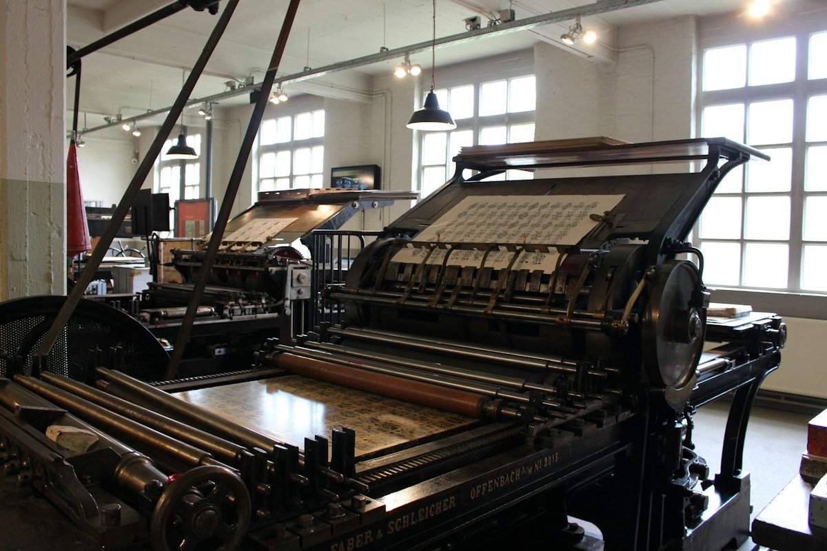
Stanhope replaced the simple screw with an ingenious system of compound knuckle levers that multiplied the pressman’s physical force exponentially as the platen reached the bottom of its stroke. This allowed a pressman to exert thousands of pounds of uniform pressure across an entire newspaper form with a single effortless pull of the handle. Stanhope’s breakthrough was followed by American innovations, including George Clymer’s majestic Columbian press (1813), adorned with a cast-iron American eagle counterweight, and Peter Smith’s Washington press (1821), which utilized a toggle-joint lever that became the standard proof press across nineteenth-century printshops.
For jobbing and commercial ephemera, manufacturers developed the clamshell platen press, immortalized by Chandler & Price and Heidelberg. In a platen press, circular ink discs and rubber composition rollers evenly distribute ink across the vertical type bed, while a moving platen opens and closes like a clamshell, allowing the pressman to hand-feed individual paper sheets with rhythmic precision. The rhythmic, mechanical heartbeat of a Heidelberg windmill press or a Chandler & Price treadle press: the clack of the grippers, the hum of the flywheel, and the solid thud of the impression, is one of the most intoxicating acoustic symphonies of industrial history.
The Tactile Deboss: Relief Sculpture and the Evolution of the Impression
A fascinating historical controversy in typography concerns the aesthetic role of the impression bite or deboss. In modern letterpress printing, contemporary designers and wedding stationers intentionally celebrate a deep, heavy impression: pushing the metal type or photopolymer plate deep into thick, soft cotton paper so that the letters form deep, physical craters that can be felt like Braille on the surface of the sheet.
Historically, however, classical master printers considered a noticeable deboss on the reverse side of the page to be a mark of careless presswork. In Renaissance and Victorian printing, paper was printed on both sides (backing up), meaning that a deep impression on the front of the sheet would push through and ruin the legibility of the text on the back. Master printers spent hours carefully building up the packing on the platen cylinder using fine tissue papers, a meticulous process known as makeready, to achieve the holy grail of printing: a kiss impression, where the type kissed the paper with just enough pressure to transfer a crisp, solid black line of ink without indenting the surface of the paper.
Yet even the most refined kiss impression upon damp handmade paper creates a subtle, microscopic relief that differs fundamentally from flat offset lithography or digital xerography. The metal type compresses the paper fibers directly beneath the letterform, creating a micro-embossed edge that catches raking natural light. When natural daylight strikes a letterpress page from the side, each letter casts a microscopic shadow into its own indented bed.
This subtle three-dimensional relief engages the human visual system’s depth perception mechanisms. The letters do not look painted on; they look embedded within the paper substrate, like carved stone inscriptions or cast bronze reliefs. To the reader’s subconscious, the text possesses physical permanence, solidity, and structural truth, commanding an attention and reverence that flat digital screens can never hope to inspire.
When readers touch these debossed letterforms, the Merkel nerve endings in their fingertips detect the distinct micro-geometric ridges of the impression. This somatosensory feedback sends immediate neural signals to the parietal lobe, creating an embodied sensory link between language and physical reality. The word ceases to be a disembodied concept; it becomes an object of tangible weight and physical presence that anchors thought in the physical universe.
The Arts and Crafts Revolt: William Morris and the Kelmscott Press
In the late nineteenth century, as the Industrial Revolution transformed printing into a high-speed, mechanized, and cheapened commercial industry, a visionary English poet, designer, and socialist launched a radical aesthetic rebellion that gave birth to the modern private press movement: William Morris and the Kelmscott Press.
Morris was horrified by the cheap, mass-produced books of the Victorian era, printed on acidic wood-pulp paper using worn modern machine type and thin, grey petroleum inks. Morris argued that the industrial machine had severed human labor from art, reducing workers to mindless cogs and turning books into ugly, disposable commodities. In 1891, Morris established the Kelmscott Press in Hammersmith, London, with a radical mission: to resurrect the noble printing standards of the fifteenth century and produce books that were complete works of total art (Gesamtkunstwerk).
Morris designed his own historical typefaces, Golden, Troy, and Chaucer, based on fifteenth-century Venetian models by Nicolas Jenson and early German Gothic types. He commissioned handmade paper manufactured from unbleached linen rags by J. Batehelder, utilizing traditional medieval watermarks; he imported pure, intense black ink made from boiled linseed oil from Hanover, Germany; and he designed hundreds of intricate woodcut borders, initial letters, and ornaments engraved by hand on boxwood blocks.
The crowning achievement of the Kelmscott Press was The Works of Geoffrey Chaucer, published in 1896, featuring eighty-seven magnificent woodcut illustrations designed by Edward Burne-Jones. The Kelmscott Chaucer is widely regarded as one of the most beautiful physical books ever created by human hands. Morris demonstrated that anemoic yearning for the past was not mere nostalgic daydreaming, but a powerful, revolutionary critique of modern industrial ugliness, proving that human beings could choose to reject disposable mass production and restore dignity, beauty, and craftsmanship to everyday life.
The Architecture of the Book: Folding, Gathering, Sewing, and Binding
Letterpress printing is only the first stage in the ancient architecture of bookmaking. Once the flat printed sheets emerge from the press, they must undergo a complex series of manual transformations carried out by master bookbinders to assemble them into a durable, functional codex.
The printed sheets are first folded by hand using a polished bone folder into multi-page gatherings or signatures (folios, quartos, or octavos, depending on the number of folds). These folded signatures are assembled in numerical sequence and placed in a bookbinding sewing frame. Using unbleached linen thread, the binder hand-sews each signature through its inner fold onto heavy hemp cords or woven linen tapes running perpendicular to the spine, creating a flexible, interconnected mechanical spine that allows the finished book to open flat without cracking or losing pages.
The sewn book block is then placed in a heavy wooden lying press, where the spine is glued with archival animal hide glue or wheat starch paste, hammered with a round-faced backing hammer to form an elegant rounded spine, and trimmed with a hand plough. Wooden boards: historically oak or beech, later high-density binder’s millboard, are attached to the linen cords, and the spine is reinforced with hand-sewn silk headbands that protect the top and bottom edges of the spine from pulling damage.
Finally, the binding is covered in noble organic materials: vegetable-tanned goat morocco leather, calfskin, pigskin, or heavy Irish bookbinding linen. The cover is decorated using heated brass finishing tools, engraved gouges, and twenty-two-karat gold leaf, pressed into the leather to create glistening, permanent gilded ornament. A traditionally bound book is a marvel of kinetic engineering: an object designed to be handled, opened, read, and passed down across centuries, maintaining its physical integrity while developing an exquisite, unique patina of age and use.
Cognitive Psychology of Reading: Tactile Mapping and Digital Frictionlessness
Why does human consciousness experience such profound satisfaction when reading physical letterpress books, while digital e-readers often leave us feeling cognitively depleted and emotionally detached? The answer lies in the cognitive psychology of reading and spatial cognitive mapping.
When an individual reads a physical printed book, the brain constructs a cognitive map of the text that relies heavily on physical spatial coordinates. The reader feels the weight of the book shifting gradually from the right hand to the left hand as pages are turned; they remember that a specific philosophical insight appeared on the upper left-hand corner of a verso page about two-thirds of the way through the volume; and they physically touch the paper’s edge when turning the page. These physical, tactile cues provide cognitive landmarks that help the brain organize, index, and consolidate memory.
In contrast, digital reading on e-readers and tablets is fundamentally frictionless and spatial-less. The screen presents an endless, scrolling ribbon of pixels where every page looks identical and occupies the exact same physical plane. The reader has no physical sense of progression, no tactile feedback, and no spatial landmarks. Neurocognitive experiments demonstrate that digital readers tend to skim, scan keywords, and suffer frequent attentional lapses, struggling to retain long-form narrative arcs or complex conceptual arguments.
Letterpress printing introduces intentional sensory friction into the reading act. The tactile bite of the type, the deckle edges of the paper, and the rhythmic turning of physical pages slow down the reader’s neurological tempo. The prefrontal cortex shifts out of reactive, rapid-fire skimming mode into a state of deep, contemplative immersion known as deep reading. The reader is no longer processing disposable information; they are participating in an embodied, contemplative communion with thought itself.
The Contemporary Renaissance: Letterpress in the Digital Age
Far from perishing with the advent of desktop publishing, digital phototypesetting, and computer-to-plate printing in the late twentieth century, letterpress printing is currently experiencing a spectacular global renaissance. Across North America, Europe, Japan, and Australia, a passionate generation of young artists, designers, typographers, and printmakers is seeking out vintage presses and rediscovering the sacred art of metal and wood type.
When commercial printing firms liquidated their heavy letterpress equipment in the 1970s and 1980s, thousands of tons of irreplaceable cast-iron presses and foundry type were sold for scrap metal. Fortunately, dedicated preservationists and private press enthusiasts rescued hundreds of Vandercook proof presses, Heidelberg platens, and cabinets of historic wood type. Today, university printmaking departments, community printshops, and independent studios are overflowing with students and artisans eager to escape computer screens and engage in tactile, hands-on physical labor.
Modern letterpress printers have developed an ingenious hybrid practice that bridges the digital and analog worlds. While many purists continue to set lead type by hand, others design digital typography on computers and output the vector artwork onto photosensitive polymer plates. These photopolymer plates can be mounted on magnetic bases and printed on traditional cast-iron presses, allowing contemporary designers to combine the infinite typographical freedom of digital software with the physical impression, ink tactile richness, and handmade paper quality of traditional letterpress.
This contemporary renaissance proves that letterpress printing is not an obsolete museum curiosity, but an essential, living artistic medium. In a world inundated with millions of disposable digital images generated every second, a letterpress print stands out as a rare, cherished treasure: an authentic physical testament to human patience, material intelligence, and the enduring beauty of handcrafted art.
The Spiritual Dimensions of Craft: Mindfulness, Patience, and Human Labor
Beyond its aesthetic and cognitive dimensions, letterpress printing embodies a profound spiritual philosophy of human craft labor. In an era dominated by instant gratification, automated algorithms, and artificial intelligence, the slow, deliberate craft of letterpress printing functions as an active spiritual practice of mindfulness and moral grounding.
To print a broadside or book on a hand press demands absolute presence and physical discipline. The printer cannot press undo; every typo requires manually unlocking the chase, picking out individual lead sorts with tweezers, and realigning the line of text. The printer must learn to listen to the subtle acoustic cues of the press, to feel the exact tackiness of the ink on the brayer, to regulate the dampness of the paper sheets, and to adjust the packing with fractions of a millimeter precision. Every stage of the process requires patience, humility, and deep respect for physical materials.
This physical discipline liberates the craftsperson from modern existential alienation. In the printshop, the worker is not an alienated spectator watching a computer screen; they are a creator whose mind, hands, and body work in harmonious coordination with natural physical laws. When the finished print is pulled from the tympan: pristine, black, debossed into creamy cotton rag, the printer experiences an honest, profound joy that no digital convenience can ever replicate.
The tactile memory of letterpress printing reminds us that the finest things in human civilization cannot be rushed, automated, or digitized. They are born in the patient, loving dialogue between human hands and physical matter. As long as human beings cherish the beauty of language and the dignity of manual craft, the gentle clank of the cast-iron press and the velvety bite of lead type will continue to imprint their timeless soul upon the pages of human history.
Comparative Diagnostic Matrix of Printing Technologies and Material Aesthetics
A rigorous typographical, material, and cognitive analysis of printing history requires systematic comparison across different printing technologies, chemical inks, substrate papers, and psychological outcomes. The physical method by which an image is transferred onto paper directly conditions its longevity, tactile texture, and cognitive impact on human readers.
The comparative diagnostic matrix below illustrates the definitive mechanical principles, ink chemistry, paper requirements, optical qualities, and neurocognitive effects that distinguish traditional letterpress relief printing from modern commercial offset lithography and contemporary digital electrophotography. This matrix synthesizes printing history, material science, and cognitive psychology.
| Printing Dimension | Traditional Letterpress Relief Printing | Modern Digital Electrophotography (Laser / Screen) |
| Image Generation Method | Three-dimensional raised relief (lead type, woodcut, photopolymer) pressed directly into paper fibers. | Electrostatic charge deposits microscopic plastic toner powder onto paper, melted flat via heated fuser rollers. |
| Ink / Pigment Chemistry | Viscous boiled linseed oil, lampblack, and natural resins; dries through oxidative polymerization; archival inert. | Styrene acrylate polymer plastic toner resin with carbon black pigments; zero oxidative cross-linking. |
| Tactile & Surface Texture | Physical three-dimensional deboss/relief; subtle paper bite; deckle edges; tactile friction and somatosensory depth. | Completely flat, slick, and frictionless surface; synthetic plastic sheen; prone to toner flaking on folds. |
| Substrate & Permanence | Handmade/mould-made 100% cotton rag/linen; acid-free neutral pH; survives 500+ years without discoloration. | Bleached wood pulp with synthetic sizing; susceptible to acid hydrolysis, yellowing, and mechanical brittleness. |
| Cognitive Reading Mode | Fosters deep reading, high spatial cognitive mapping, long narrative retention, and aesthetic reverence. | Encourages rapid skimming, cognitive fragmentation, visual fatigue, and low long-term narrative retention. |
As demonstrated across these technological and cognitive dimensions, letterpress printing represents an irreplaceable summit of human communication design. By uniting physical craftsmanship, noble chemistry, and tactile sculpture, traditional letterpress dignifies human thought, proving that the most profound ideas deserve an enduring, tactile body that can be held, cherished, and preserved across centuries.
Frequently Asked Questions Regarding Letterpress Printing and Book Arts
What was the true metallurgical secret of Gutenberg’s movable metal type alloy?
Gutenberg formulated an alloy of eighty percent lead, fifteen percent antimony, and five percent tin. Antimony was the critical secret: unlike most metals that shrink as they cool, antimony expands slightly upon solidification, forcing the molten alloy into the finest crevices of the matrix to produce razor-sharp letterforms.
What is the California job case, and how was it arranged for hand typesetting?
The California job case is a wooden drawer divided into compartments that holds an entire font of type. Compartments were arranged ergonomically based on frequency of letter usage in English: common letters like e, t, and a occupied large central boxes close to the compositor’s hands, while rare letters sat on the perimeter.
Why did historical printers consider a heavy deboss into the paper to be a flaw?
In traditional book printing, sheets were printed on both sides (backed up). A heavy deboss pushed through the paper, ruining the legibility and appearance of the text on the reverse page. Master printers perfected makeready to achieve a kiss impression that transferred ink cleanly with zero surface indentation.
How does traditional letterpress ink dry compared to modern digital printer inks?
Letterpress ink is made from boiled linseed oil and lampblack, which dries through chemical oxidation and polymerization over days, forming a tough, permanent resin film. Digital toner consists of plastic powder melted onto paper, while inkjet inks soak in through evaporative solvent absorption.
What makes hundred-percent cotton rag paper vastly superior to modern wood-pulp paper?
Cotton rag paper is made from pure, long-chain cellulose fibers that are acid-free and pH neutral. It does not yellow or become brittle over centuries, unlike chemically digested wood-pulp paper that suffers from acid degradation and breaks down rapidly within decades.
Why did William Morris establish the Kelmscott Press in the late nineteenth century?
Morris was repulsed by the shoddy, disposable mass-produced books of the Industrial Revolution. He founded the Kelmscott Press in 1891 to resurrect fifteenth-century printing standards, using handmade linen paper, custom typefaces, and hand-cut woodcuts to prove that books could be works of total art.
How does physical tactile reading enhance human memory retention compared to screens?
Physical books provide spatial cognitive landmarks: shifting weight between hands, page corners, and paper textures. These physical cues help the brain construct a spatial cognitive map of the text, promoting deep reading and significantly improving long-term memory retention.
What is the historical significance of the deckle edge on handmade paper?
The deckle edge is the soft, feathered, organic border formed where liquid paper pulp seeps beneath the wooden deckle frame during hand casting. In historical printing, it stood as physical proof that a sheet was cast individually by hand rather than cut mechanically from industrial rolls.
How do modern letterpress studios combine digital design with traditional presses?
Modern letterpress artists often create digital vector typography on computers and output the design onto photosensitive photopolymer plates. These relief plates are mounted on magnetic bases and printed on antique cast-iron presses, uniting digital design freedom with the tactile beauty of relief printing.
Conclusion: The Indelible Mark of the Human Spirit
The journey through the art of letterpress printing reveals that the written word achieves its greatest emotional resonance when it is physically anchored in the material world. Across five centuries of technological acceleration, the quiet clatter of movable lead type and the deep impression of a cast-iron press stand as enduring monuments to humanity’s desire to give lasting physical form to fleeting human thought. In the velvety bite of black ink on deckle-edged cotton rag, we discover a realm where craftsmanship, intellectual depth, and tactile beauty unite in sublime harmony.
As we hold a letterpress-printed book today, tracing our fingertips across the sculpted relief of its pages, we are connected to a noble lineage of type founders, compositors, and pressmen who dedicated their lives to honoring the dignity of language. The tactile memory of letterpress printing reminds us that true cultural greatness is measured not by how fast we can broadcast disposable pixels, but by the love, patience, and reverence we invest into creating enduring physical treasures that will speak of our humanity to generations yet unborn.
